Welcome to the third installment in my Data Visualization Basics series. We touched on this topic a bit in the last post but I wanted to cover it a little more in-depth today. While there are several great chart choosers out there, and I highly recommend a few, I do think it’s worth a more in-depth exploration of the different types of charts we could use for the same types of data.
Last time we looked at choosing the right data and finding those key points, but now we have to determine the best way to present that data. I’m going to start with percentages from categorical data as this is something fairly common in my assessment practice.
Let’s start with some categories.

Here we have a table that tells us a little bit about where our students are from. This is a nice, neat, straightforward data set. Two categories. Easy. You might be tempted to use a pie chart….but I will echo just about every other data visualization person out there and say PLEASE, NO. Unless these numbers were 75% and 25% or something similar, a pie chart is just too hard for us to interpret effectively. There are better ways.
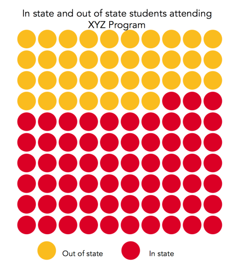
One of my favorite methods is the icon array. I will cover how to make an icon array using a free online program in an upcoming post after this series. You can utilize these in several fashions but the basic gist is you’ve got 100 dots/blocks/images in 10 rows by 10 columns. I use these for up to 3 different categories, but no more. More than that and it gets hard to interpret.

Another thing I like about icon arrays is that you can get fairly specific with your significant figures. Here I’ve changed the 37.25% to more accurately reflect those partial points.
![]()
This is my personal preference, but it’s not entirely accurate. It’s more accurate than the first example where I used rounding, but it’s still done by eye on my part, and therefore not mathematically 25%. We can fix this by…..putting a pie chart in your icon array (if you’re using circles)
![]()
It hurt me a little to make a pie chart but I think it’s worth making an exception in this case. My preference is still for the partially filled circle or icon, but this is also an option.
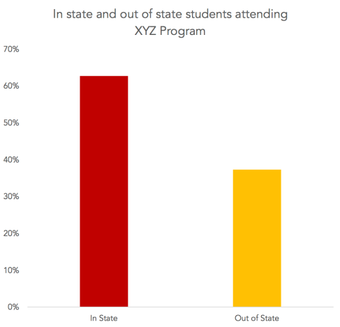
Another common way to show these dichotomous percentages would be a standard bar chart.

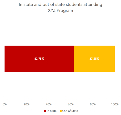
Or even a stacked bar chart.

While this may seem boring, I would point out that if your report has several dichotomous variables, then I prefer to use a variety of chart types to show these percentages in different ways. It gets a little boring and redundant to have icon array after icon array, however at the same time, perhaps you should consider if those items are truly your key points. Remember, not everything needs a visual.
Next time we are going to talk about my favorite thing, color! And stay tuned for the post on how to make icon arrays!
Other posts in the Data Visualization Basics Series can be found here:
One thought on “Data Visualization Basics: Chart Variety”