In the last few weeks I have gone over a few aspects of data visualization that help craft the foundations of visualizing your assessment data, but in my opinion none are more critical than color. Color takes a plain microsoft excel graph from generic to representative of your organization or institution. It’s the foundation of branding in most organizations, especially when those organizations are universities. If you’re from Virginia as I am, you know the difference between Virginia Tech orange and Tennessee Volunteers orange. Moreover, if you’re a Tennessee fan you know that there is only one correct orange and you will correct everyone in an off-color.
Before we get into the specifics of applying these colors to your graphics, let’s do a bit of an experiment. If you carefully look over your university’s page, you’ll notice the main colors but you will also see some that you do not recognize as your university colors, however those colors are most likely still a part of your universities color palette and were carefully selected to go with the main colors. Let’s look at my institution, Iowa State University.
Here is our main homepage. You clearly see our university red and yellow colors, complimented with some white accents in font and line choices. These are all part of what everyone in the midwest will recognize as ISU colors.

Then if we move over to the library’s home page we see the ISU red banner, but then the tabs here are blue, green, and yellow. Yellow is an ISU color but not THAT yellow…and blue and green aren’t anywhere in a traditional ISU logo.

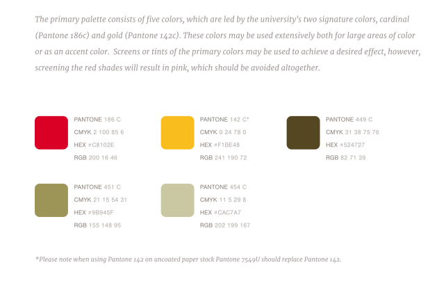
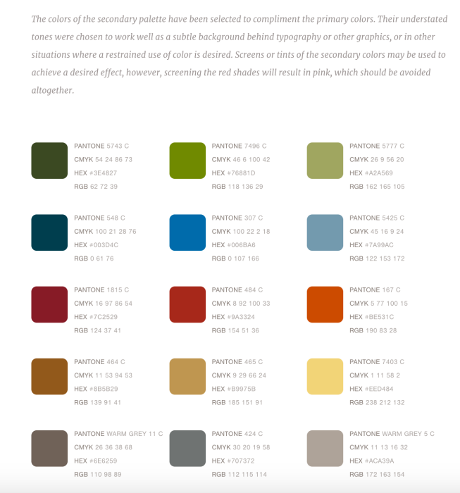
What’s that about? Well, those colors are actually still part of the university color scheme, from the “secondary color palette”. All universities I’ve ever interacted with have at least one if not two color palettes. Here you can see ISU’s primary and then secondary color palette.


Now we can see where those blues and greens come from. And seeing the colors all together really allows us to understand how these colors work together. Someone designed this for us. Our job is halfway done thanks to them! Try searching your university followed by the words “color palette” and see what you find. I’ve yet to find a major institution without some type of color guidelines easily searchable on the internet. If you can’t find your colors, but your university does have a logo you can still get the colors with a bit of work. Feel free to drop me a line if you want some help or stay tuned as I will cover that in a future blog post!
Along with a general sense of the colors associated with our universities, we can also often find other “brand guidelines” that we are supposed to adhere to when representing our institution. How many of us have messed that up at conferences? For example at ISU we are never to use purple with any of our colors or in any presentations. If you’re at Virginia Tech as I once was, you know better than to use blue with any orange, lest you look like those hoo-vians from up north. (Kidding, UVA) If we are using the microsoft default palette…what are the first two colors to come up? Yes, blue and orange. Blue and orange doesn’t represent ISU and it certainly doesn’t represent Virginia Tech. So why are we putting those basic blue graphs on our assessment reports?? Let’s do a better job at representing our data AND our institutions in our reporting practices!
So go find your color palettes. In my next post we will learn how to get those exact colors into your data visualizations!
Other posts in the Data Visualization Basics Series can be found here: