Welcome back! I have gotten a bit behind on blogging as my institution just underwent our accreditation review, but now that we are past that hurdle I can refocus and get back to my Data Visualization Basics series!
Last time we talked about finding our institutional color palettes. Now we are going to see how to use that information and apply it to our data visualizations in Excel. I won’t repeat everything I said last week, except to say that branding yourself with either your company or your institution is critical.
Let’s start by making a basic bar chart in Excel. I made up some numbers about people that attended a non-existent program.
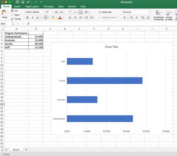
There we go. Basic Excel blue. This tells me nothing about the institution, the program, or what to focus on. Now let’s change that. I’m going to brand this graphic with my ISU color palette.
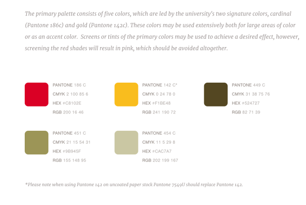
Looking at this palette I see some sets of codes and numbers that will be helpful. For this tutorial I’m going to focus on the Hex Codes, as I have a MacBook and am running Excel 2016, these are the easiest for me to use. So be aware, things might be different if you are on a PC or running a different version of Excel.
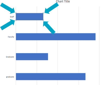
For this graph I want to recolor each bar with a different color from my ISU palette. In order to do this, I need to select an individual bar. When I first click the graph, all four bars are “highlighted” (the dots around the bars indicate they are selected).
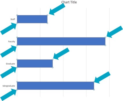
If I click just the top bar, twice (slowly, not a double click) it will become the only one highlighted.
Now, I’ll change the color. There are two places in Excel you can change the color. One is on the side in the “Format Data Point” menu, which you can bring up by ****** and the other is on the Home tab with the paint can. Either works just fine and both should give you the same color input options. I prefer the side bar menu which looks like this. 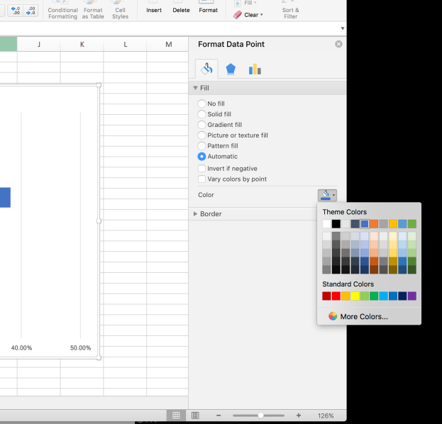
As you can see, I have already clicked the paint can and that brings up the theme colors and other color menus.
From here we want to select “More colors”, because although I do see some red and yellow options here in this palette, these aren’t my ISU red and yellow colors.
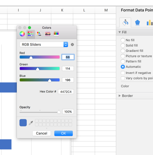
When I select “More Colors” this is the menu that comes up. Yours may be on the color wheel, or one of the other icons at the top when you start. If you’re on the same version of Excel as I am, you should be able to click the icon with the sliders that you see in the above picture. From this menu I can put in my Hex Code. I’ll do this for the ISU red, using the numbers and letters we found in our palette.
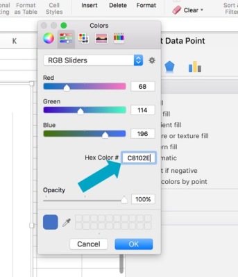
If you don’t see an option to input the Hex Codes, you can probably find the RGB numbers or sliders. Once I’ve put in the code, I can hit “TAB” or click “OK” and my bar will have changed to the exact ISU red I wanted.
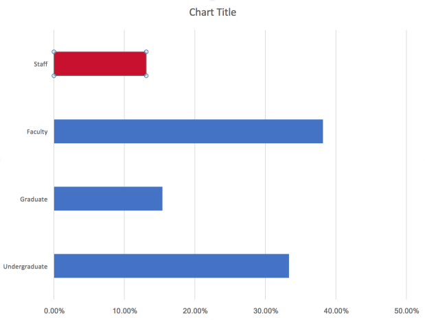
Perfect! To recolor the other bars, I follow the same steps, but put in the different hex codes for each of the different palette colors.
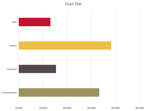
Look how much better that is already. It clearly goes with the institution. If our logo or other branding is on the report, it will add cohesiveness and really emphasize what our graph is about. Furthermore if we are presenting this at a conference, using our university poster or powerpoint template, this fits a lot better than some basic Excel blue (no offense, microsoft). Here’s a side by side comparison:


Now, here’s a secret. If you’re working in a spreadsheet with a lot of different graphs or tabs, your custom colors will be saved under your “Recent Colors”. You might want to make a “University Palette” spreadsheet as a template that has your colors already in so you don’t have to put the hex codes in every time.
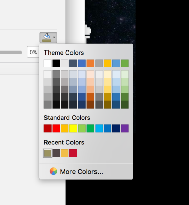
At my office we use the same excel sheet each year for a particular survey and just update the data longitudinally, so once I’ve put the colors into my “Senior Exit Survey Data” spreadsheet, each year I just enter the new data and the graphs and colors are already there.
I hope this helps you with your visuals. I’d love to see photos of your updated graphs with your institutional palettes. Tweet them to me @projecthalfdone!
Other posts in the Data Visualization Basics Series can be found here: