New Year, New Goals


New Year New Goals | ProjectsHalfDone

Somehow we are already halfway through the first month of 2018! I hope it has been going well for you.

Like most, I’ve been contemplating my goals for the year and determining what are the most important aspects of my life that I want to work to improve. These goals tend to fall in to different categories for all of us; personal goals, fitness goals, and of course work related goals. As we spend something around 35% of our waking hours during our lifetime at work…this is a major category for most of us. I think it is important to discuss our goals and to put them out there so that we might be held accountable in some fashion. Without further ado, here are my 2018 goals as they relate to work.

  1. Protect my time – This means not saying “yes” to every single thing that walks in my door. This means not booking meetings during the time I’ve already dedicated on my calendar for writing. This means protecting my time from myself…meaning distractions, my phone, ect.
  2. Write more – I’ve been doing better about this in 2017, but I really want to make 2018 my year of writing. This can be blogging, writing an article, or just editing prior writing. Writing is one of the most important parts of most of our jobs here in academia, and I can certainly improve my practice.
  3. Stand up – I have a standing desk. I need to use it. Research shows that sitting all day is as bad for our health as smoking. I’ve seen evidence of the detrimental effects of sitting in my own physical condition in the last year, having injury after injury that all seemed to get better the more I moved and the less I sat.

I know that doesn’t seem like a lot, but these are some of the things that I think will help me to be more engaged and productive at my job, as well as enjoy it more. I have other health and fitness goals, but I also try to limit those to manageable numbers that I can directly examine for progress.

What are your 2018 work goals? Do you set work goals or just personal ones? I’d love to hear about what you envision for the year ahead!

#eval2017


Eval17 | ProjectsHalfDone.png

This week I’m at the American Evaluation Association‘s annual conference. I’ll be presenting on data visualization with my good friend and colleague from Virginia Tech. I will post an update next week on all the amazing evaluation, assessment, and data visualization awesomeness but for now here’s a recap of my favorite AEA conference moments and why you should join AEA!!

Past Conference Highlights

  • MQP Selfies
  • Seeing my favorite people
  • Meeting Chris Lysy of FreshSpectrum
  • Chris drawing a cartoon I helped inspire
  • Learning from Stephanie Evergreen
  • Going to a speakeasy with Stephanie, Chris and the whole #dataviz crew
  • Statistics coloring books
  • Meeting a ton of new eval friends to keep in touch with throughout the year!

Stay tuned for this year’s highlights and join AEA!

Data Visualization Basics: Hex Code Tutorials

Hex Code Tutorial | ProjectsHalfDone.jpg

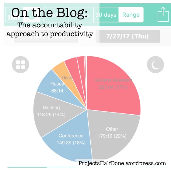
Welcome back! I have gotten a bit behind on blogging as my institution just underwent our accreditation review, but now that we are past that hurdle I can refocus and get back to my Data Visualization Basics series!

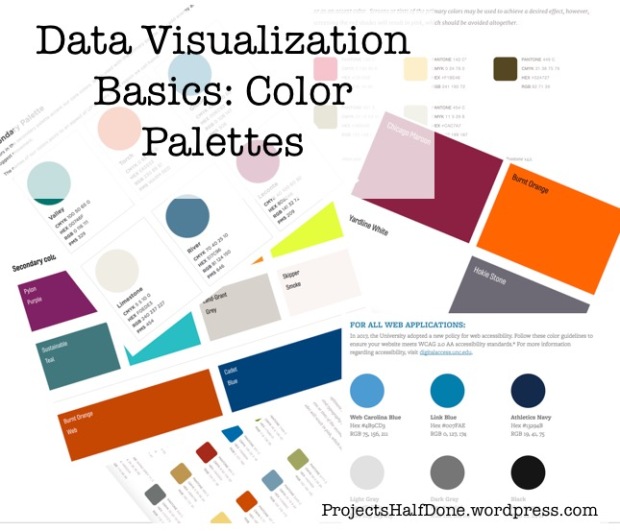
Last time we talked about finding our institutional color palettes. Now we are going to see how to use that information and apply it to our data visualizations in Excel. I won’t repeat everything I said last week, except to say that branding yourself with either your company or your institution is critical.

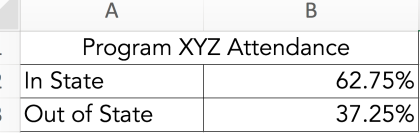
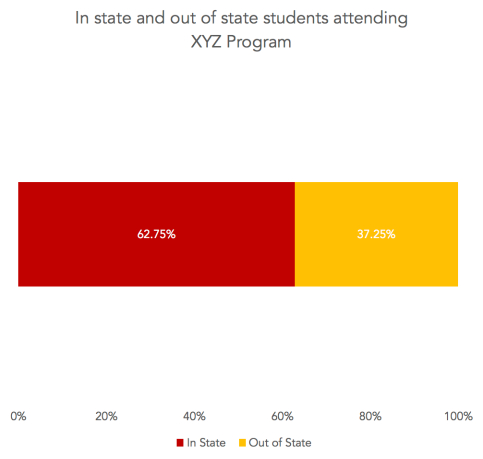
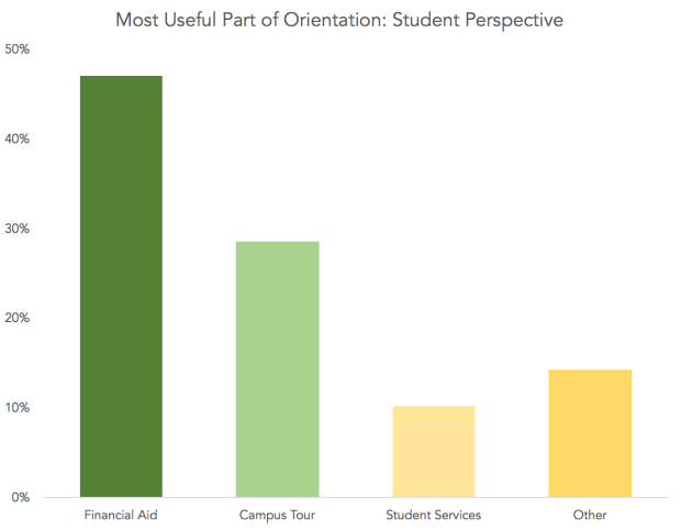
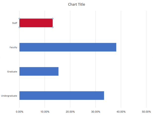
Let’s start by making a basic bar chart in Excel. I made up some numbers about people that attended a non-existent program.

Basic Excel Graph | ProjectsHalfDone.png

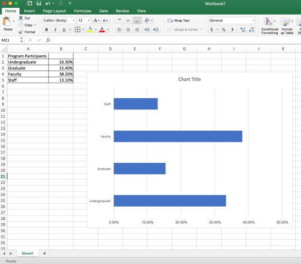
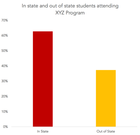
There we go. Basic Excel blue. This tells me nothing about the institution, the program, or what to focus on. Now let’s change that. I’m going to brand this graphic with my ISU color palette.

Primary Colors.png

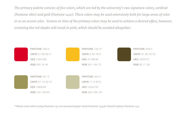
Looking at this palette I see some sets of codes and numbers that will be helpful. For this tutorial I’m going to focus on the Hex Codes, as I have a MacBook and am running Excel 2016, these are the easiest for me to use. So be aware, things might be different if you are on a PC or running a different version of Excel.

For this graph I want to recolor each bar with a different color from my ISU palette. In order to do this, I need to select an individual bar. When I first click the graph, all four bars are “highlighted” (the dots around the bars indicate they are selected).

All Bars | ProjectsHalfDone.jpg

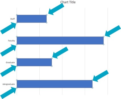
If I click just the top bar, twice (slowly, not a double click) it will become the only one highlighted.

One Bar | ProjectsHalfDone.png

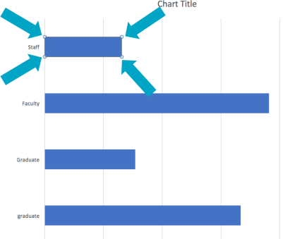
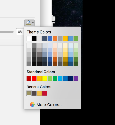
Now, I’ll change the color. There are two places in Excel you can change the color. One is on the side in the “Format Data Point” menu, which you can bring up by ****** and the other is on the Home tab with the paint can. Either works just fine and both should give you the same color input options. I prefer the side bar menu which looks like this. Format Data Menu | Projects Half Done.png

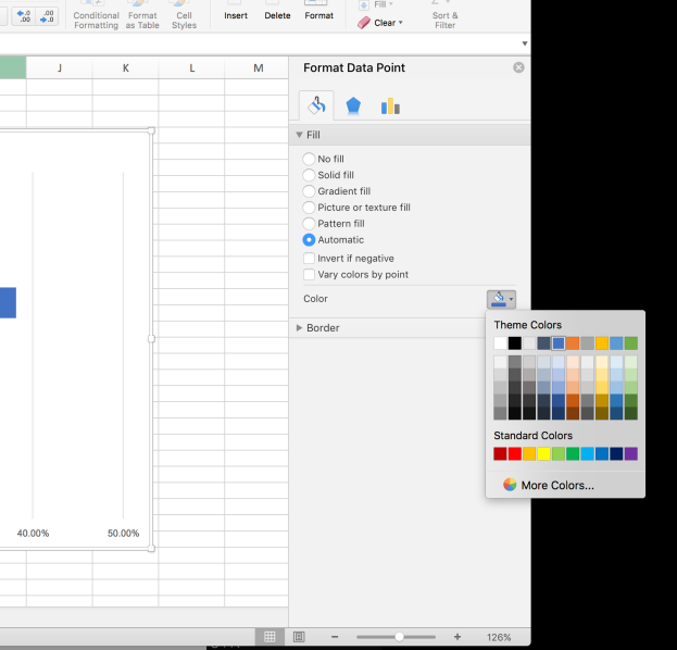
As you can see, I have already clicked the paint can and that brings up the theme colors and other color menus.

From here we want to select “More colors”, because although I do see some red and yellow options here in this palette, these aren’t my ISU red and yellow colors.

More Colors | ProjectsHalfDone.png

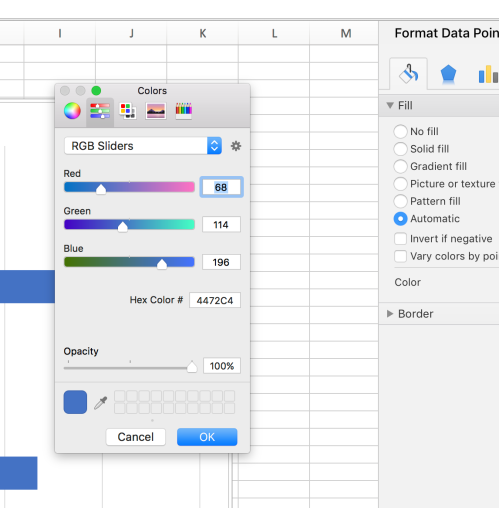
When I select “More Colors” this is the menu that comes up. Yours may be on the color wheel, or one of the other icons at the top when you start. If you’re on the same version of Excel as I am, you should be able to click the icon with the sliders that you see in the above picture. From this menu I can put in my Hex Code. I’ll do this for the ISU red, using the numbers and letters we found in our palette.

Hex Code Entered | ProjectsHalfDone.jpg

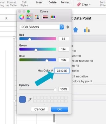
If you don’t see an option to input the Hex Codes, you can probably find the RGB numbers or sliders. Once I’ve put in the code, I can hit “TAB” or click “OK” and my bar will have changed to the exact ISU red I wanted.

OneBar | ProjectsHalfDone.png

Perfect! To recolor the other bars, I follow the same steps, but put in the different hex codes for each of the different palette colors.

Full ISU Palette | ProjectsHalfDone.png

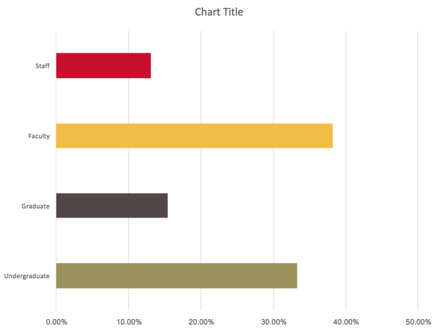
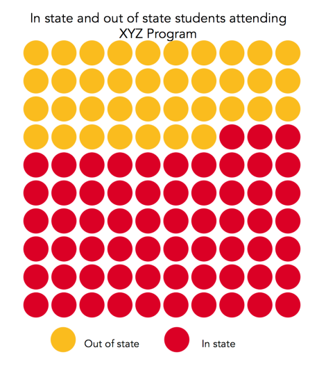
Look how much better that is already. It clearly goes with the institution. If our logo or other branding is on the report, it will add cohesiveness and really emphasize what our graph is about. Furthermore if we are presenting this at a conference, using our university poster or powerpoint template, this fits a lot better than some basic Excel blue (no offense, microsoft). Here’s a side by side comparison:


Now, here’s a secret. If you’re working in a spreadsheet with a lot of different graphs or tabs, your custom colors will be saved under your “Recent Colors”. You might want to make a “University Palette” spreadsheet as a template that has your colors already in so you don’t have to put the hex codes in every time.

Recent Colors | ProjectsHalfDone.png

At my office we use the same excel sheet each year for a particular survey and just update the data longitudinally, so once I’ve put the colors into my “Senior Exit Survey Data” spreadsheet, each year I just enter the new data and the graphs and colors are already there.

I hope this helps you with your visuals. I’d love to see photos of your updated graphs with your institutional palettes. Tweet them to me @projecthalfdone!

Other posts in the Data Visualization Basics Series can be found here:

Data Visualization Basics: Color Palettes

Color Palette Basics | ProjectsHalfDone.jpg

In the last few weeks I have gone over a few aspects of data visualization that help craft the foundations of visualizing your assessment data, but in my opinion none are more critical than color. Color takes a plain microsoft excel graph from generic to representative of your organization or institution. It’s the foundation of branding in most organizations, especially when those organizations are universities. If you’re from Virginia as I am, you know the difference between Virginia Tech orange and Tennessee Volunteers orange. Moreover, if you’re a Tennessee fan you know that there is only one correct orange and you will correct everyone in an off-color.

Before we get into the specifics of applying these colors to your graphics, let’s do a bit of an experiment. If you carefully look over your university’s page, you’ll notice the main colors but you will also see some that you do not recognize as your university colors, however those colors are most likely still a part of your universities color palette and were carefully selected to go with the main colors. Let’s look at my institution, Iowa State University.

Here is our main homepage. You clearly see our university red and yellow colors, complimented with some white accents in font and line choices. These are all part of what everyone in the midwest will recognize as ISU colors.

Data Viz Secondary Palettes | ProjectsHalfDone.png

Then if we move over to the library’s home page we see the ISU red banner, but then the tabs here are blue, green, and yellow. Yellow is an ISU color but not THAT yellow…and blue and green aren’t anywhere in a traditional ISU logo.

Data Viz Color Palettes | ProjectsHalfDone.png

What’s that about? Well, those colors are actually still part of the university color scheme, from the “secondary color palette”. All universities I’ve ever interacted with have at least one if not two color palettes. Here you can see ISU’s primary and then secondary color palette.

Primary Colors.png

Secondary Colors.png


Now we can see where those blues and greens come from. And seeing the colors all together really allows us to understand how these colors work together. Someone designed this for us. Our job is halfway done thanks to them!  Try searching your university followed by the words “color palette” and see what you find. I’ve yet to find a major institution without some type of color guidelines easily searchable on the internet. If you can’t find your colors, but your university does have a logo you can still get the colors with a bit of work. Feel free to drop me a line if you want some help or stay tuned as I will cover that in a future blog post!

Along with a general sense of the colors associated with our universities, we can also often find other “brand guidelines” that we are supposed to adhere to when representing our institution. How many of us have messed that up at conferences? For example at ISU we are never to use purple with any of our colors or in any presentations. If you’re at Virginia Tech as I once was, you know better than to use blue with any orange, lest you look like those hoo-vians from up north. (Kidding, UVA) If we are using the microsoft default palette…what are the first two colors to come up? Yes, blue and orange. Blue and orange doesn’t represent ISU and it certainly doesn’t represent Virginia Tech. So why are we putting those basic blue graphs on our assessment reports?? Let’s do a better job at representing our data AND our institutions in our reporting practices!

So go find your color palettes. In my next post we will learn how to get those exact colors into your data visualizations!

Other posts in the Data Visualization Basics Series can be found here:

Data Visualization Basics: Chart Variety

Chart Variety | ProjectsHalfDone.jpg

Welcome to the third installment in my Data Visualization Basics series. We touched on this topic a bit in the last post but I wanted to cover it a little more in-depth today. While there are several great chart choosers out there, and I highly recommend a few, I do think it’s worth a more in-depth exploration of the different types of charts we could use for the same types of data.

Last time we looked at choosing the right data and finding those key points, but now we have to determine the best way to present that data. I’m going to start with percentages from categorical data as this is something fairly common in my assessment practice.

Let’s start with some categories.

Attendance Table | ProjectsHalfDone.png

Here we have a table that tells us a little bit about where our students are from. This is a nice, neat, straightforward data set. Two categories. Easy. You might be tempted to use a pie chart….but I will echo just about every other data visualization person out there and say PLEASE, NO. Unless these numbers were 75% and 25% or something similar, a pie chart is just too hard for us to interpret effectively. There are better ways.

One of my favorite methods is the icon array. I will cover how to make an icon array using a free online program in an upcoming post after this series. You can utilize these in several fashions but the basic gist is you’ve got 100 dots/blocks/images in 10 rows by 10 columns. I use these for up to 3 different categories, but no more. More than that and it gets hard to interpret.

Rounding Chart | ProjectsHalfDone.png

Another thing I like about icon arrays is that you can get fairly specific with your significant figures. Here I’ve changed the 37.25% to more accurately reflect those partial points.

Icon Array Filling | ProjectsHalfDone.png

This is my personal preference, but it’s not entirely accurate. It’s more accurate than the first example where I used rounding, but it’s still done by eye on my part, and therefore not mathematically 25%. We can fix this by…..putting a pie chart in your icon array (if you’re using circles)

Icon Array with Pie | ProjectsHalfDone.png

It hurt me a little to make a pie chart but I think it’s worth making an exception in this case. My preference is still for the partially filled circle or icon, but this is also an option.

Another common way to show these dichotomous percentages would be a standard bar chart.

Regular Bar | ProjectsHalfDone.png

Or even a stacked bar chart.

Stacked Bar | Projects Half Done.png

While this may seem boring, I would point out that if your report has several dichotomous variables, then I prefer to use a variety of chart types to show these percentages in different ways. It gets a little boring and redundant to have icon array after icon array, however at the same time, perhaps you should consider if those items are truly your key points. Remember, not everything needs a visual.

Next time we are going to talk about my favorite thing, color! And stay tuned for the post on how to make icon arrays!

Other posts in the Data Visualization Basics Series can be found here:


Data Visualization Basics: Choosing your data wisely

Choosing Data Wisely | ProjectsHalfDone.jpg


Welcome back to the second post in my Data Visualization Basics series. Today I want to chat about what data will best serve you for visuals.

With assessment data we often have mountains of excel spreadsheets filled mostly with quantitative data. A multitude of options exists for the purposes of visualizations, but sifting through these options is critical for effective visualization.

Before you create your visual, consider the key points of your message. What is the purpose of this assessment? What do you want your audience to focus on? Find those 3-5 main messages and focus on visualizing those. Too many visuals and graphics can be just as overwhelming as too much text. Find the balance.

Additionally, it is important to consider what facts are often overlooked. As someone working in assessment, we know our data well. We know what stands out and often we also know what important points are hidden in the reports we spend hours creating. Find the points that are hidden or muddy and see if a visual will help bring these to light.

When thinking about the types of data, some options for visuals are as follows:

  • Quantitative
    • Percentages
    • Likert scale data
    • Ranges with medians
    • Basic counts
    • Financial data
    • Zip codes
  • Qualitative
    • Quotes
    • Pictures
    • Pathways/Mind maps
    • Logic models
    • Comments sections
    • Timelines

With each of these, a wide range of visualizing options exist. Depending on what I am trying to do, I will consult a chart chooser to help guide my process. For qualitative data, Stephanie Evergreen has an excellent resource here. Ann K. Emery has an essential chart chooser that has great quantitative options, found here.

Once your data is selected and you’ve found your key points, utilizing the chart choosers can help ensure your message is presented in the most straightforward way possible. It also may help to play around with a few different charts and test them out on colleagues to make sure your message is getting across. The right data and chart are the first steps in quality visualizations of assessment data. Next post we will talk about color which to me is the critical element of many visualizations. Be sure and stay tuned!

Other posts in the Data Visualization Basics Series can be found here:

Data Visualization Basics: Applying Deiter Ram’s Principles of Design to Assessment Data

Applying Deiter Ram's Principles of Design to Assessment Data | ProjectsHalfDone.jpg

This is the first in a series of Data Visualization Basics blog posts focused on visualizing academic assessment data. Before we begin I should also mention I am not a graphic designer. I’m an assessment person and a social scientist by training and I’ve often been frustrated by the lack of attention our reports get. I find that data visualization can greatly impact our messaging so I hope you find this useful for your work as well.

I want to start this series with some principles of design. These tenants were developed by the German industrial designer Dieter Rams. His products and designs have withstood the test of time because of his sense of design and attention to detail. He developed his method of design in to ten basic principles of that focus on the product.

I have taken these principles and translated them slightly for data visualization because although we are not creating a physical product, the end result is still something that must be well designed and useful if we are going to get the most out of our data.

Good (data visualization) design:


Is innovative

How you’re visualizing data now is very different than the 3-D graphs of the 90’s. We will continue to innovate and develop better design to tell the story of our data.

Makes a product data useful

Data was collected to be used. It was analyzed to be used. This is one of the biggest reasons to engage in data visualization. Our goal is for our assessment data to be useful. Well designed visuals allow us that platform.

Is aesthetic

We want our visuals to be aesthetically pleasing. We want people to do more than glance over them. We want them to engage with them and really understand the meaning. By utilizing an eye-catching visual we can engage the reader much more than with a typical paragraph or data table.

Makes a product data understandable

Sometimes all of those spreadsheets and rows and columns are a headache. Sometimes we miss connections. Good design helps us understand our data. It also helps others understand our key points for programmatic decision making purposes.

Is unobtrusive

Good visuals are unobtrusive. They don’t distract you with unnecessary 3-D images or animations or loud colors. They are a microphone, not a megaphone, for your data.

Is honest

Your visual should be an honest representation of your data. Don’t use a visual to make your data something it isn’t. Don’t dissolve whole categories just to make the visual fit. That’s not good design.

Is long-lasting

10 years from now we should still be able to look at the same report and understand it. Visuals aren’t fashion, they are tools that stand the test of time.

Is thorough down to the last detail

This means every aspect of a graphic is considered. The shape, the balance, the color, the font, the size and the data should all work together to provide the reader with your key points. Font is very often overlooked in so many reports.

Is environmentally economically friendly 

Given that many of our reports go online, or in email via PDF our designs are typically environmentally friendly.. It is important to note that our design efforts also be economical. This should be something you can find the time to do with minimal expense.

Involves as little design as possible

Less is more. You don’t need to overdesign, over color, or overthink your visuals. Only the essentials should go in to your visualizations.

When we engage in data visualization considering these principles can help guide our process and ensure that our end result has improved our data reporting process. By considering these factors we can create useful, honest, and clear designed visuals to showcase our data and drive home our critical message.

Do you have any other principles that you consider when doing data visualizations or when working with assessment data? Let me know in the comments!

Five quick tips for a new semester


apple-256263_640.jpg

It’s that time again.

The Targets and Walmarts of the country are filled with shoppers holding lists of school supplies, once vacant college towns are jammed with traffic, and summer research projects are coming to a close. It’s time to get in gear for the 2017-2018 school year.

Are you ready?

Like many academics and teachers….I’m a back to school nerd. I love shopping for office supplies, I love pencils, I love new notebooks and I love fresh starts. I think this is one of the most beautiful things about life in academia, while in most jobs you keep moving forward, there’s often not a clear delineation, there’s often not the excitement of a new year, new faces, new starts. I appreciate that I get that excitement at least once a year.

But back to school means more than shiny new office supplies. It means a new chance to be your best self. Your best research self, your best teacher self, your best academic self. Here are some quick tips on how I try to start the semester off to reach my goals.

Five tips for a new semester:

  1. Get organized – Get a paper planner, use Evernote, use Trello, something. Make sure you have a way to organize your day, your week, your semester. Something beyond post-it notes. Make sure you’re able to look ahead, and go ahead and outline what is coming up for the next month. The more organized you can make things, the less stress you will have later in the semester.
  2. Make a schedule – More on how I write my schedule in this blog post, but overall, it’s good to have a plan, even if most of your day is devoted to research or devoted to teaching, plan to protect your research/writing time, plan some time for moving around during the day, plan some time for project work, and then stick to the plan.
  3. Make a reading plan – Dr. Raul Pacheco-Vega has some great tips on how to keep up with the reading that is important for your class and your career. Check out his blog here.
  4. Set a student-related goal – If you are in academia, you’re here because of and for students. At the end of the day, no matter your research agenda, research dollars, role as an administrator or as a maintenance worker, you’re here for the students. What’s your goal for students this year? If you’re in the classroom, that’s easy, set a goal of learning everyone’s name by the end of the month. If you’re an administrator, or a researcher or someone who doesn’t often interface with students, make a goal to say hi to students in the hallway, make a goal to meet 3 students this semester. Build bridges with someone new. Welcome the students to our institution. It’s theirs now too. Set at least one goal devoted towards them.
  5. Clean your office – I know this seems simple but when is the last time you cleaned out that filing cabinet, or cleaned off that shelf? What is even up there on top of the book case? Take some time during the day, or maybe come in on the weekend if you don’t want to be seen standing on your chair in the middle of the day, but take an hour and some disinfecting wipes…and clean things off. You’ll feel better in a clean and organized space and it’s better for your health too.

Good luck with the new semester, your research goals, and the traffic! I hope these tips help you have a productive and less stressful start to the new school year.


5 Tips for a New Semester | ProjectsHalfDone.jpg

What are your tips for heading back for a new semester? Are you a back to school junkie or do you dread this time of year? Let me know in the comments.

The analysis of “other”

The analysis of "other" | ProjectsHalfDone.jpg

Today I want to chat a little bit about survey analysis. Recently I’ve heard a few stories that disturbed me. One in particular resulted in what I would consider falsifying data. A large organization had hired an outside consultant to conduct some survey work. In the report from the consultant, the response category of “other” had disappeared from a question and after a careful look at the raw data, the responses of “other” had been split up and lumped into the other existing categories. While some people that responded “other” might have actually provided a response that fit in one of the original categories….they still selected the response of “other”.

Is this cleaning the data or is this mishandling the data?

It’s one thing to clean the data for incomplete responses or responses that did not record properly but it’s another to move categories around after the survey had closed. To me, this indicates poor survey design. This isn’t always the case, but it certainly happens.

Now, not to say that we shouldn’t use the category of “other” or that well designed surveys don’t have this category. Quite the opposite, actually. There are times when you absolutely should be using “other” to allow participants to describe their particular experience or when a program has several parts that may fluctuate and you won’t be able to adjust the survey for last minute additions or issues. “Other” can be a very important and informative category.

So let’s pretend that we’ve created a survey for a local college’s orientation and we do need to include the category of “other”. (Note: The category “other” should not be used when pertaining to gender identity. People aren’t “other”. Don’t make them feel that they are. For more information click here.) We have distributed the survey and collected responses from about 50 participants. One question that used “other” was our question on which part of college orientation students liked best.


Analysis of "other" | ProjectsHalfDone.png

Looking at the data, some students picked “other”. (And a lot of students seemed to enjoy the talk on financial aid which is a little ridiculous but hey, it’s not real data) Our reaction is often to just ignore this category…but let’s stop for a second and look at it. If we look at the data for more than 10 seconds we will actually see that “other” had more responses than one of our actual categories. This…might indicate a flaw in our survey. So let’s look at the actual data. We should have had a space for students to fill in what they meant by “other”. If we didn’t, then we really have failed to represent the people we are surveying.

Cateogry of Other | ProjectsHalfDone.png

From reading the responses we can see that several students enjoyed meeting the faculty members. Maybe we should have had that as a category. We can also see that one student did like the campus tour which was an option but they had other thoughts on it, so they wanted to share those. That information is still important and that response should not be moved to be grouped with “campus tour” in my opinion. The respondent chose “other” and we need to respect their choice. To change the category is going to far with “data cleaning”.

By looking at what falls under the “other” umbrella we can get a better sense of what we need to ask in our future surveys and what a reasonable number of our respondents were saying. This was an oversimplified example, but I think it translates. I’ve seen so many rich and important points come from the category of “other”. This category needs to be examined, reported, and considered in future survey design. Too often “other” is swept under the rug. Don’t let that happen in your survey design or reporting!


Do you overlook “other”? Have you seen other surveys poorly handling this category? What’s the best information you’ve found hidden in an “other” response? Let me know in the comments!


The accountability approach to productivity

In my last post I talked about the importance and impact of scheduling your day, or at least having a general schedule for those days where you’re not rushing from meeting to meeting. Today we are going to talk a little more about schedules, but more specifically about how knowing your schedule can help with productivity.

I’ve tried a lot of things when it comes to increasing productivity. Having a schedule is just one component of that equation. For those of us in academia, especially in the summer, our days are mostly up to us. Sure, meetings happen, but if we aren’t teaching classes or leading programs, we can choose what we work on each day. We get to pick where to spend our time. It’s both wonderful and terrible at the same time. A lot of us got here because we are very good at following the rules, showing up, doing what we are told, and then suddenly, once your PhD is completed, your schedule is your own. What do you do with it? There’s work to be done but…the deadlines are often weeks or even months away. How do you cope?

For me, it’s accountability. I need to have some kind of report or product to show me where I’ve been and what I’ve done with my time. I’ve tried a few different things, paper planners, to-do lists, evernote, but what seems to work best for me is a time tracking app. It’s similar to what an independent consultant would use, or a contractor, or anyone who needs to estimate hours spent on different tasks. There are several out there. Damon over on the Art of Productivity has reviewed several options so I won’t repeat his efforts, but you should check them out (Link: http://artofproductivity.com/top-time-trackers/).

Personally, I like ATracker. I used it on and off during grad school but now that my time is really under my direction it helps me be accountable to myself and know where I’m spending the bulk of it (no shocker that it’s meetings and email…). It took me a little while to remember to use it and I admit I still forget sometimes, especially on days that my schedule gets thrown off, but I can always go back and edit the hours and add in what I missed.

Here, you can see how I’ve spent my morning so far. Again…mostly email and organization.

Accountability and productivity | ProjectsHalfDone.PNG

I like the fact that I can color code my tasks. For me, each of the colors represents a portion of my PRS (research percentage, university service, etc) and allows me to quickly see how much of my time I’m devoting to those activities and then compare it to my PRS document in my annual review.

If I look and yesterday’s breakdown I can see that I spent a little over 70% of my time on Professional Practice (red categories in my world). I can also look at the past 30 days, or entire year. Again, great data to take to that annual review.

The accountability approach to productivity | ProjectsHalfDone.PNG

By having a clear graphic (even though it is a pie chart….ugh) of how I’m spending my day, I feel a sense of accountability. I need to make sure I’m spending my time effectively. It’s not always perfect, but it keeps me on track. If I check the app at the end of the week and see that I did little to nothing in the Research category….I know I need to up my game and work on that next week.

Having some type of accountability helps you stay focused and on track. Accounting for your time can give you a huge push in the direction of increased productivity. I know it’s worked for me. How do you account for your time? Have you used any other apps or trackers? Leave a comment down below!

The accountability approach to productivity | ProjectsHalfDone.jpg